Optimal Prose
The wall of text is a 15th-century manufacturing defect
I. The Regression
Open a 13th-century manuscript of Justinian's legal code. The central text sits in the middle of the page. Surrounding it on all sides is the Glossa Ordinaria — a layer of commentary, cross-references, and structural summaries that a reader can access without losing their place in the primary text. Section boundaries are marked in red ink (rubrics). New chapters begin with illuminated capitals that anchor the eye across a sprawling page. Marginal notes guide interpretation.
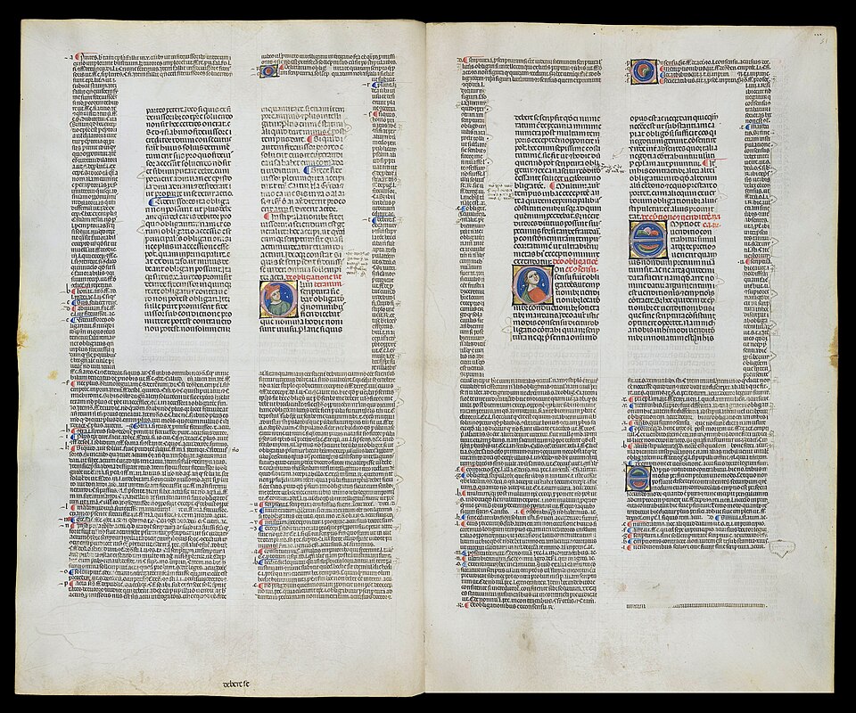
Digestum Vetus with Glossa Ordinaria of Accursius, 13th century. Central text surrounded by commentary, cross-references, illuminated capitals. Proto-hypertext — 500 years before the printing press standardized the wall of text.
This is proto-hypertext. A multi-layered information architecture designed for study, reference, and non-linear access. It evolved over centuries of use by scribes and scholars who understood that dense text requires navigational infrastructure.
Then Johannes Gutenberg invented the printing press. The press was an information revolution — it plummeted the cost of books and democratized access to knowledge. It was also a formatting regression. Early mechanical presses were constrained by the physics of typesetting: creating complex layouts with multiple columns, varying font weights, and colored inks was technically difficult and prohibitively expensive. The fastest, cheapest method of production was continuous, single-color blocks of uniform lead type.
The economic constraint was temporary. The aesthetic preference it created was permanent. Over five centuries, a manufacturing limitation calcified into a literary convention. The unbroken paragraph — originally necessitated by the rigid limitations of metal type — became the hallmark of the "serious" author. Paragraph indentation itself arose because rubricators couldn't keep pace with printing deadlines, and books were sold with blank paragraph beginnings that no one ever filled in.
The wall of text is not an optimized information transfer mechanism. It is a 15th-century manufacturing defect that became an aesthetic preference that became a cultural norm that became a seriousness signal. At no point in this chain did anyone optimize for reader comprehension.
II. What the Evidence Says
The Nielsen Norman Group has studied how humans read informational text for over 25 years. Their core finding, from web usability research replicated across dozens of studies: 79% of readers scan any new page they encounter. Only 16-20% read word-by-word. The original data is from screen reading, but the underlying cognitive mechanisms — working memory limits, visual tracking, scanning heuristics — are properties of human biology, not of screens.
This is not laziness or digital-age attention decay. Eye-tracking studies show that readers employ specific non-linear scanning behaviors — the F-shaped pattern (horizontal across the top, then down the left margin), the layer-cake pattern (jumping between headings), and the spotted pattern (searching for visually distinct keywords). They are the reading strategies that human visual cognition actually uses.
The effect size of designing text for these strategies is not marginal:
| Intervention | Measured Improvement |
|---|---|
| Scannable layout (headers, bold keywords, hierarchy) | +47% usability |
| Concise writing (half the word count) | +58% usability |
| Combined (scannable + concise + objective language) | +124% usability |
A separate meta-analysis of 103 studies (N = 12,201) quantified the signaling effect — the impact of structural cues like headers, bold text, and organizational summaries on learning outcomes. The results: a medium effect size for knowledge transfer (g+ = 0.33) and a strong effect size for retention (g+ = 0.53). Structural cues don't just make text easier to scan. They free working memory from the task of navigating the page, redirecting cognitive resources toward actually understanding the content.
The mechanism is specific. John Sweller's Cognitive Load Theory divides the reader's mental burden into three types: intrinsic load (the inherent difficulty of the material), extraneous load (the burden imposed by poor presentation), and germane load (productive effort spent building understanding). A wall of text maximizes extraneous load. The reader's limited working memory must simultaneously decode complex syntax, hold early clauses in memory to contextualize later clauses, and search for the core argument buried in the prose. Structural cues — headers, short paragraphs, visual hierarchy — reduce extraneous load, which frees capacity for germane load. The reader spends less effort navigating and more effort thinking.
The signaling effect is disproportionately beneficial for complex, high-element-interactivity text — exactly the kind of text that dense non-fiction books contain. This directly contradicts the publishing industry's assumption that "sophisticated material requires dense, unbroken prose." The more complex the argument, the more the reader needs structural signaling to process it.
III. Why It Persists
If the evidence is this clear, why does the wall of text remain the default format for non-fiction books? Three selection pressures maintain it.
Seriousness Signaling
Dense, unbroken prose signals intellectual gravitas. Structured, scannable text signals "manual," "textbook," or "blog post." Publishers and editors possess a deeply ingrained fear that headers, bullet points, and tables "dumb down" the material. A manuscript submitted with aggressive structural formatting risks being perceived as lacking intellectual depth — regardless of its actual information density.
This is the same mechanism that makes legal language incomprehensible. A 2024 MIT study (Martínez, Mollica, and Gibson, published in PNAS) found that legalese functions like magical incantations: convoluted, center-embedded clauses serve not to improve legal precision but to project authority. When non-lawyers were asked to write laws, they spontaneously adopted the same convoluted style — even though they preferred plain English versions and rated them equally enforceable. The researchers' term for this: a "performative utterance" meant not to communicate clearly but to alter the reader's perception of the writer's authority.
Dense non-fiction prose operates identically. The complexity signals "this is serious intellectual work" to the reader's pattern-matching system, regardless of whether the complexity serves comprehension. The format is an epistemological cargo cult: it mimics the surface attributes of rigor (density, difficulty) without the relational structure (clarity, mechanism, evidence).
Publishing Economics
A non-fiction manuscript of 25,000-30,000 words is dismissed by the industry as a "booklet." The standard range — 80,000 to 100,000 words — produces the physical heft that justifies a $25 price point. The entire pricing structure of traditional publishing is tied to page count.
Applying the NNG's evidence-based recommendation — "cut word count in half" — would simultaneously optimize reader comprehension and destroy the economic viability of the physical book. The wall of text is a padding mechanism: it ensures the product meets the volume requirements of the publisher's P&L model. The perceived authority of the author is linked to the literal weight of their book.
Academic Prestige
In academia, the same dynamic operates through peer review. Dense prose is the expected register of serious scholarship. Structural formatting signals pedagogy, not research. An academic paper with bullet points and tables reads as a technical report, not a contribution to knowledge. The tenure committee evaluates the work in the register it was written in — and scannable text reads as insufficiently rigorous, because rigor has been confused with impenetrability.
All three pressures select for the same outcome: format optimized for the writer's perceived authority rather than the reader's actual comprehension.
IV. The Neurodivergent Tax
Walls of text are cognitively inefficient for everyone. For approximately a quarter of the population, they are functionally inaccessible.
Dyslexia affects roughly 15% of the population. ADHD affects 5-10%. Autism spectrum conditions affect about 2%. These populations overlap (AuDHD is increasingly recognized), but the combined figure is substantial. For these readers, the wall of text is a systematic barrier.
The primary mechanical failure occurs during the return sweep — the rapid eye movement from the end of one line back to the beginning of the next. In unbroken, uniform text without visual landmarks, tracking errors become frequent: skipped lines, repeated lines, lost place. Each tracking error forces the reader to spend working memory on re-orientation rather than comprehension. For readers with ADHD or working memory deficits, this cycle — read, lose place, search, re-orient, read — depletes cognitive endurance rapidly.
Headers, short paragraphs, and white space provide the vertical visual anchors that prevent tracking drift. They are navigational infrastructure for how human eyes physically move across a page.
Autistic readers face a compounding challenge. Research using single-subject designs has shown that explicit text structures — compare-contrast formats, numbered progressions, clear organizational hierarchies — significantly improve reading comprehension for readers on the autism spectrum. When neurotypical authors rely on implicit narrative flow rather than explicit structural organization, they lock out readers who require transparent information architecture to process complex non-fiction.
The wall of text imposes a tax on neurodivergent readers — a tax paid in comprehension, in time, in abandonment — so that the text can signal seriousness to neurotypical gatekeepers. The exclusion is structural, maintained by aesthetic inertia.
V. The Counter-Argument
The case for continuous prose is real. A meta-analysis of over 150 effect sizes (75+ unique samples, 33,000+ participants) found that narrative texts are significantly more easily comprehended and recalled than expository texts. The mechanism: human cognition is wired for story grammar — setting, conflict, character, resolution. Continuous narrative prose leverages this wiring effortlessly, engaging long-term memory schemas without requiring explicit structural signaling.
Continuous prose earns its place when the goal is emotional resonance, metaphor-building, or complex multi-step reasoning that depends on cadence and pacing. A skilled author can use paragraph length and sentence rhythm to control the reader's attention — slowing them through difficult material, building suspense before a revelation. This is a legitimate technology of persuasion and understanding.
The failure is forcing expository content — data, evidence, step-by-step arguments, comparative analysis — into a narrative format that is structurally unsuited for it. When a non-fiction book presents statistical claims, policy analyses, and multi-variable comparisons as flowing paragraphs, it is applying the wrong tool. The cognitive load research is specific: narrative content benefits from narrative format; expository content benefits from structured format. Most non-fiction books contain both. The optimal format shifts between them based on what type of information is being presented.
| Content Type | Optimal Format | Why |
|---|---|---|
| Narrative, analogy, metaphor | Continuous prose | Leverages story grammar; emotional resonance requires pacing |
| Evidence, data, comparisons | Tables, lists, structured layout | Reduces extraneous load; enables rapid extraction |
| Complex argument | Hybrid: prose with headers and key-insight markers | Prose for reasoning chain; structure for navigation |
VI. The Design Implication
Edward Tufte self-published all his books to maintain total control over layout — integrating text directly alongside high-resolution images, using marginalia and varying column widths. His rejection of traditional publishing norms — and the quality of the work — produced millions of copies sold. Matthew Butterick demonstrated that formatting errors can alter the course of history, analyzing the butterfly ballot that likely cost Al Gore the 2000 U.S. presidential election. Richard Saul Wurman coined "information architecture" in 1976 and argued that all information can be organized by Location, Alphabet, Time, Category, or Hierarchy — and that traditional non-fiction neglects Category and Hierarchy at the page level, forcing the reader to perform the organizational labor the author neglected.
A first-principles non-fiction book format would look like what medieval scribes already knew:
- Visual hierarchy. Headers and sub-headers that let the reader build a mental model of the argument before processing the details.
- One idea per paragraph. Readers routinely skip secondary ideas buried deep in long paragraphs because the opening sentence didn't signal the shift in topic.
- Tables for comparisons. Any time you're comparing three or more things across two or more dimensions, a table transfers the information faster and more accurately than prose.
- Marginalia restored. Footnotes and endnotes force the reader to leave the text, losing their place and breaking working memory. Sidenotes or inline references maintain spatial continuity.
- Narrative prose where narrative is the point. Analogies, stories, emotional arguments — continuous prose is the correct tool for these. Use it. Just don't force evidence tables into paragraph form because that's "how books look."
This is not "dumbing down." It is the opposite. Radical clarity demands more from the writer, not less. Compressing an argument into scannable form while preserving its logical structure is harder than burying it in paragraphs — just as good compression preserves relational structure while bad compression maps surface attributes. A wall of text is easy to produce. A well-structured page requires the author to understand their own argument well enough to make its architecture visible.
The publishing industry's equation — dense prose = serious, structured text = lightweight — is exactly backwards. The format that hides the argument behind syntactic complexity is the one that lacks confidence in the argument's own strength. The format that makes the argument's structure visible is the one that trusts the reader to evaluate it.
Related:
- The Compression Paradox — Good compression preserves causal structure; bad compression maps surface attributes. The wall of text is a format that maps the surface attribute of seriousness rather than the relational structure of the argument
- Cargo Cult Epistemology — How the aesthetics of rigor substitute for actual rigor
- The Containment Pattern — How institutions absorb critique of their practices without changing anything
- The Severed Map — How institutional incentives prevent knowledge from reaching the people who need it
Sources and Notes
Usability and scanning behavior:
- Jakob Nielsen, "How Users Read on the Web," Nielsen Norman Group (1997). Original study establishing the 79% scanning / 16-20% word-by-word finding. Twenty-five years of subsequent NNG research have consistently replicated the core result.
- Jakob Nielsen, "Concise, SCANNABLE, and Objective: How to Write for the Web," Nielsen Norman Group (1997). Measured usability improvements: scannable layout +47%, concise writing +58%, combined +124%.
Signaling effect and cognitive load:
- S. Schneider, M. Beege, S. Nebel, G.D. Rey, "A meta-analysis of how signaling affects learning with media," Educational Research Review 23 (2018), pp. 1-24. 103 studies, N = 12,201. Retention g+ = 0.53 [0.42, 0.64]; transfer g+ = 0.33 [0.22, 0.43].
- John Sweller, "Cognitive Load Theory," in Psychology of Learning and Motivation, Vol. 55 (Academic Press, 2011). Foundational framework distinguishing intrinsic, extraneous, and germane cognitive load.
Legal language as authority signal:
- E. Martínez, F. Mollica, E. Gibson, "Even laypeople use legalese," Proceedings of the National Academy of Sciences 121(35), e2405564121 (2024). Found that convoluted legal language functions as a "magic spell" — signaling authority rather than ensuring precision. Non-lawyers spontaneously adopted the same style when asked to write laws.
Narrative vs. expository comprehension:
- R.A. Mar, M. Li, A.T.C. Nguyen, C.P. Ta, "Memory and comprehension of narrative versus expository texts: A meta-analysis," Psychonomic Bulletin & Review 28 (2021), pp. 732-749. 150 effect sizes, 75+ unique samples, 33,000+ participants. Narrative texts easier to comprehend and recall. Note: Egger's regression test indicated publication bias for memory tests; comprehension findings appear more robust.
Neurodivergence and text structure:
- A.J. Parker and T.J. Slattery, "Spelling ability influences early letter encoding during reading: Evidence from return-sweep eye movements," Quarterly Journal of Experimental Psychology 74:1 (2021), pp. 135-149. 120 participants: less-skilled readers make more return-sweep undershoot errors and launch return-sweeps closer to the end of the line.
- L. Franzen, G. Stark, A.A. Johnson, "Individuals with dyslexia use a different visual sampling strategy to read text," Scientific Reports 11, 6449 (2021). Dyslexic readers show atypical saccadic direction deviations, including abnormal return-sweep patterns.
- S. Caldani et al., "Reading performance in children with ADHD: an eye-tracking study," Annals of Dyslexia 72 (2022), pp. 509-527. Eye movement recording during reading in 96 children across four groups (dyslexia, ADHD + dyslexia, ADHD alone, typically developing). Fixation duration and saccade patterns significantly different in dyslexia groups.
- C.R. Carnahan and P.S. Williamson, "Does Compare-Contrast Text Structure Help Students with Autism Spectrum Disorder Comprehend Science Text?", Exceptional Children 79:3 (2013), pp. 347-363. Single-subject reversal design: explicit text structure instruction significantly improved reading comprehension for middle school students with ASD.
Information design tradition:
- Edward Tufte, The Visual Display of Quantitative Information (Graphics Press, 1983); Visual Explanations (Graphics Press, 1997). On visual hierarchy and the principle that "if everything is emphasized, then nothing is emphasized."
- Matthew Butterick, Practical Typography (2013-present). On typography as a tool of rhetorical persuasion, including the analysis of the Palm Beach butterfly ballot.
- Richard Saul Wurman, Information Anxiety (Doubleday, 1989). Originator of "information architecture" (1976); the LATCH heuristic for organizing information.
History of the book:
- On chapter numbering and tables of contents: Jerome and Eugippius, 5th century CE. See "Chapter (books)," Wikipedia, for an accessible overview of the historical development.
- On the Glossa Ordinaria as proto-hypertext: standardized commentary surrounding the central text of the Bible and Justinian's legal codes, allowing non-linear access to cross-references and structural summaries.
- On the printing press as formatting regression: William Caxton (1481) attempted to preserve manuscript navigational features in print. Economic pressure standardized single-color uniform type. Paragraph indentation arose when rubricators couldn't keep pace with printing deadlines.